You know that feeling of coming home from a long trip, sweaty and sore from being cramped in economy class for 14 hours, simultaneously hungry but also full from too much dry airplane food and fake airport Starbucks?
And then there’s that feeling when you flop down on your duvet that smells like library books and small children, and breathe out a full body sigh.
Aahhhhhhhh
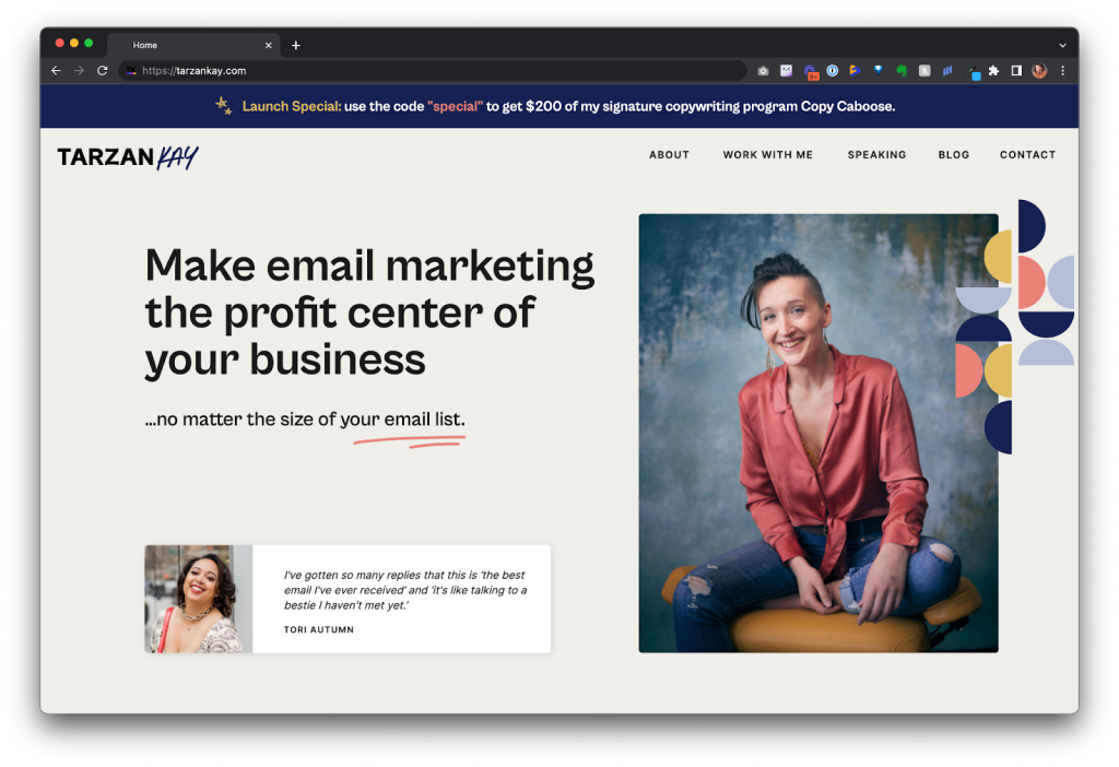
That’s what it felt like to look at my new website for the first time.

I wanted to cry with relief / excitement / pleasure / happiness, even a little sadness.
This new site is yet another expression of my hard work these last few years. I’m really, really excited to share it with you today.
Some people write symphonies.
Some people do sculpture.
Others make paintings.
I made a website, and I believe it is as much an artistic creation as any of the above.
I worked with Yevgenia Davarashvili from One6Creative. (She said it’s okay to call her Gigi, which is easier to type and fun to say, but I love the way the name Yevgenia rolls off the tongue—like a song or a pirouette!)
When I was interviewing designers for the job, there was another designer I really liked that cost about $3800 less, but once I’d spoken with Gigi I just knew she was the person for the job.
Brilliant ideas rolled effortlessly from her lips. She asked thoughtful questions. She had a vision. In fact, her vision for my brand was even bigger than mine. I just wanted to not shrink every time I clicked over to tarzankay.com.
I haven't written a website in years. Gigi told me where to put opt-ins, helped me figure out how to organise my offers, and told me which sections needed to be cut completely.
Sandra and I are meticulous (borderline annoying) about copy and design, and file complaints when a single icon is three pixels out of place or needs to be rotated 12 degrees. Gigi welcomed our feedback, and made suggestions about our suggestions.
This website was an absolute labour of love and I am SO PROUD to be sharing it with you today.
Click here to check out my new website —>
FACTS YOU MIGHT FIND INTERESTING
The platform:
The new site is now built and hosted on Showit. Editing is apparently really easy, so my team and I will be able to keep the site updated going forward. Goodbye WordPress, so you NEVER! (Urm, except when we upload new blogs.)
The price:
It cost $8K USD to have Gigi design and build it. That price included a “brand refresh” that didn’t seem all that different from a rebrand but apparently is. After several interviews with Sandra and I, Gigi chose a palette of tones from the previous brand.
I also ended up spending an extra $1200 to move my main opt-in landing pages to Showit with the updated branding, which is still a WIP.
She noted that a site this size usually costs between $8-12K. Keep in mind that I wrote all of the website copy myself. Even the best designer can’t make a great website with so-so copy, so keep that in mind if you’re budgeting for a new site.
What I’m most proud of:
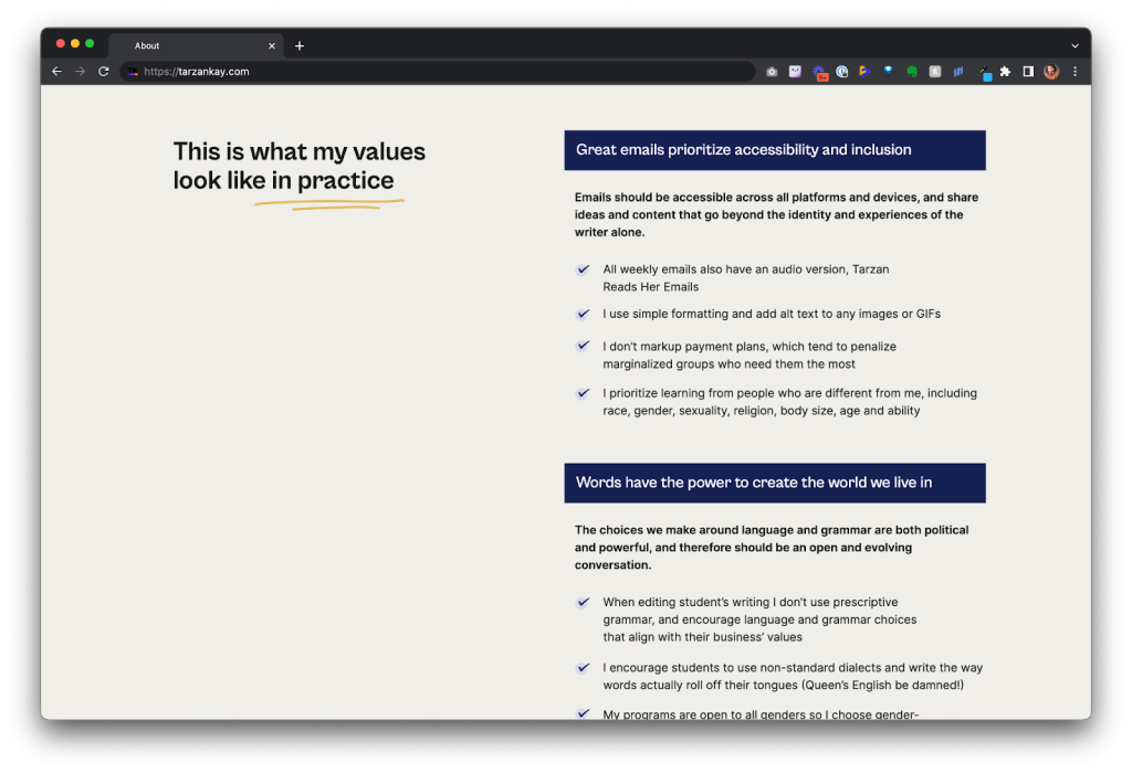
These days it feels like everyone is calling themselves an ethical this-or-that. Without context it doesn’t really mean anything—and it’s actually really confusing and adds a lot of noise to an already noisy industry.
On the about page, you’ll see what my business values are and very specific examples of what they look like in practice. Hat tip to Kelly Diels, who does this on her website.

Something most people won’t notice:
I still have a lot to learn about accessibility but one thing I’m proud of is all of the alt text I wrote for the website. You can read our master document here if you’re curious. I made some strategic choices about how I talk about skin tone, race and gender, which is just one more way I got to express my business’ values.
I had fun writing phrases like, “A handsome, light-skinned Asian man with stylish hair and glasses smiles broadly from behind a laptop” (Shoutout to my friend Sho!)
Gigi’s most brilliant idea:
My best work is my emails, and I’ve always lamented that they have a 35-second shelf-life in your inbox. I’ve long dreamed of putting them on the internet somehow.
Gigi had the idea of making the blog look like an inbox, and uploading some of my emails there. It was really this idea that got me to spend the extra $3800 on her. See what it looks like —>
Got questions? I’d love to answer them. I’ll probably do a few follow-up emails about this new website, and I’d love to hear what you most want to know about.
Hit “reply” and share your reflections and questions.
XOT
P.S.
Missed last Friday’s Ask Me Anything?
- Here’s the Ask Me Anything Replay Link
- Here’s the 2-part series I did last Fall on red flags in the coaching industry, which I promised to share
- And here’s the podcast version of the red flags series
P.P.S.
Wish you had a website this epic?
To celebrate the launch – and because I know a lot of people will be visiting my new site and thinking “I wish my copy was this good” – I’m putting Copy Caboose on sale until the end of the month.
Use the promo code “special” to get 40% off at checkout.